War of Olympus Manual
Editorial Design and Lore Expansion
Project Overview
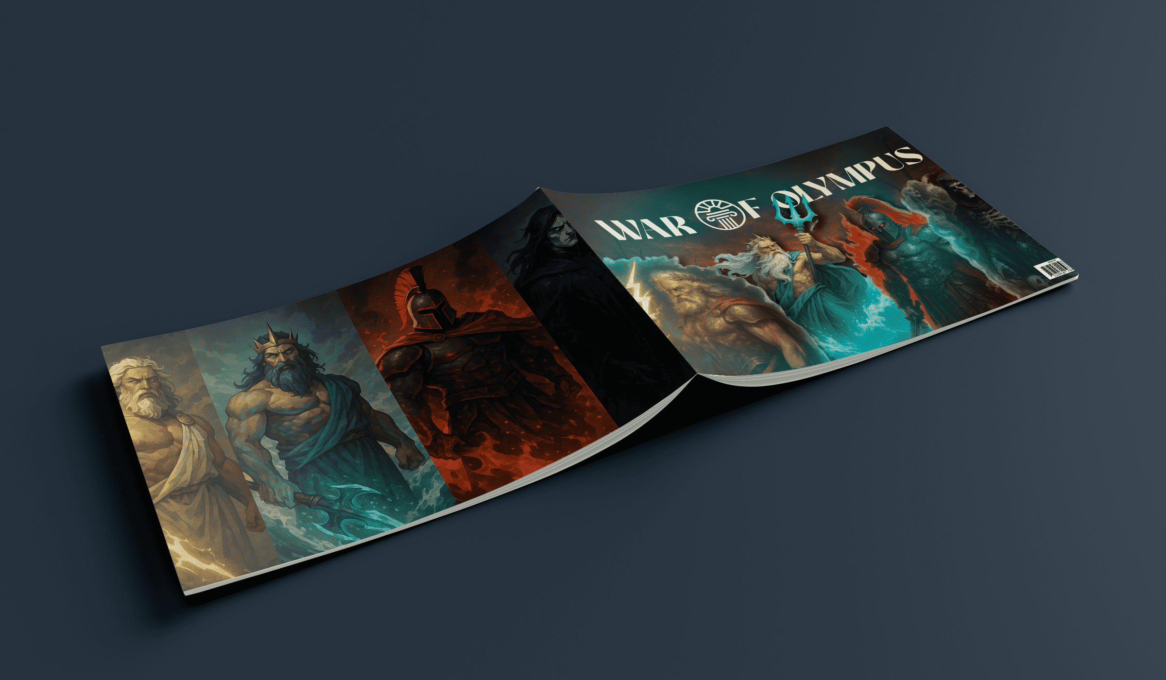
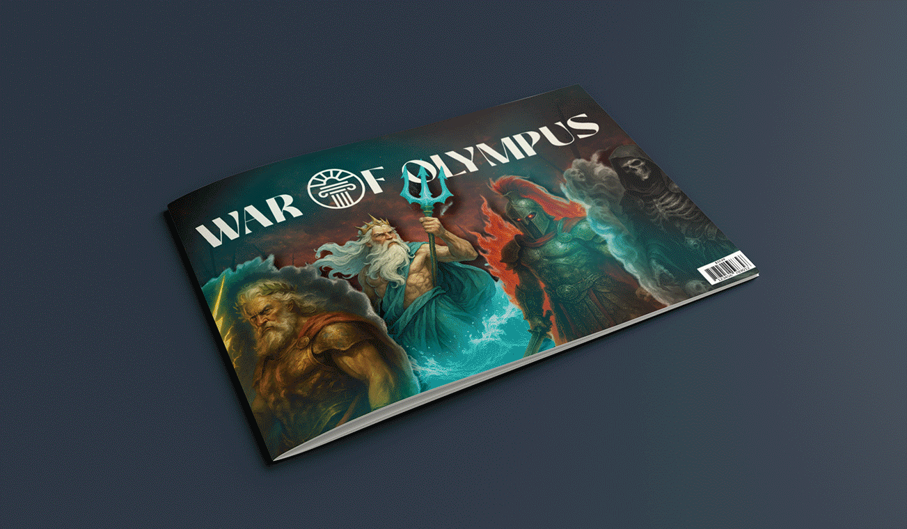
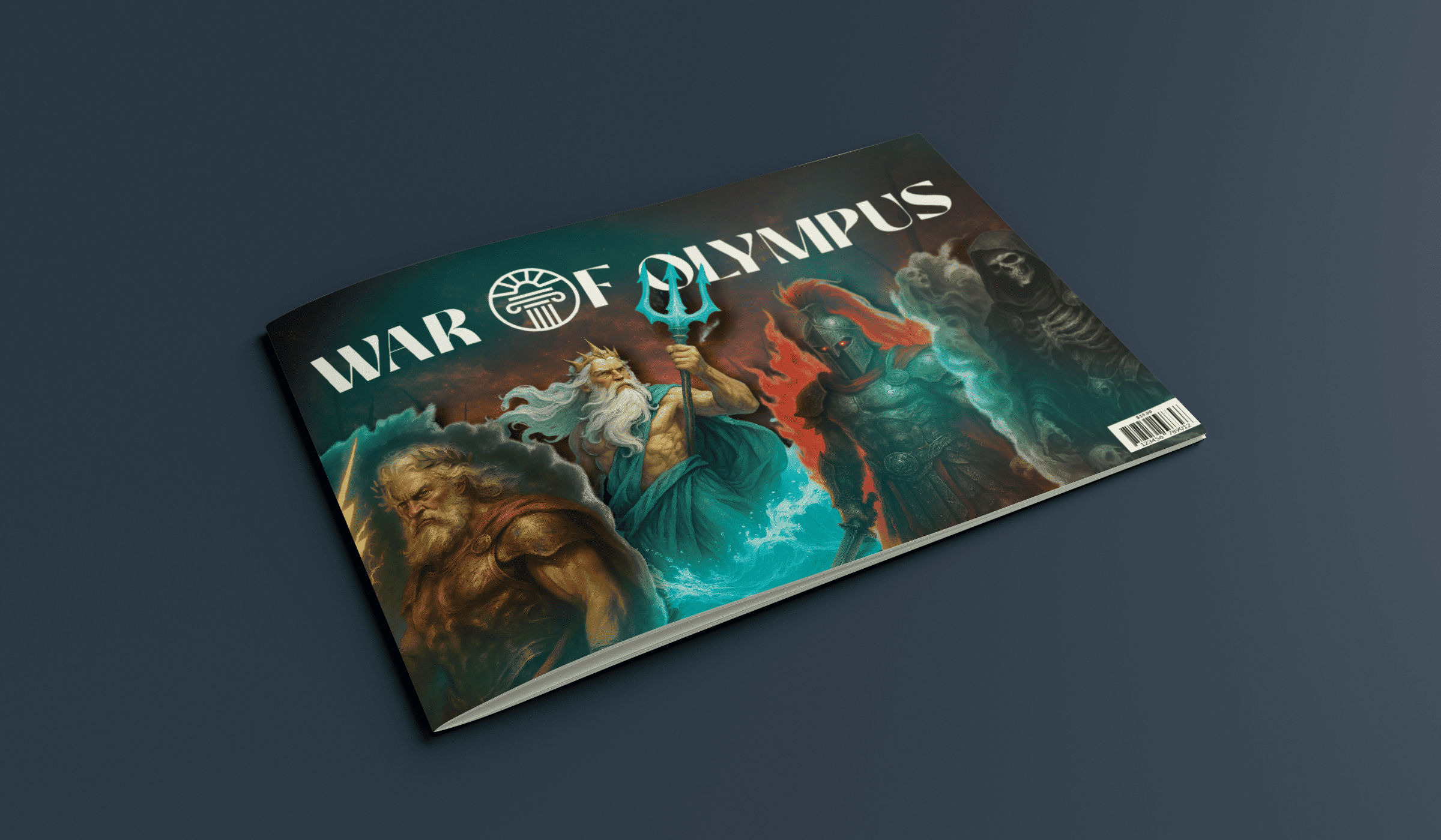
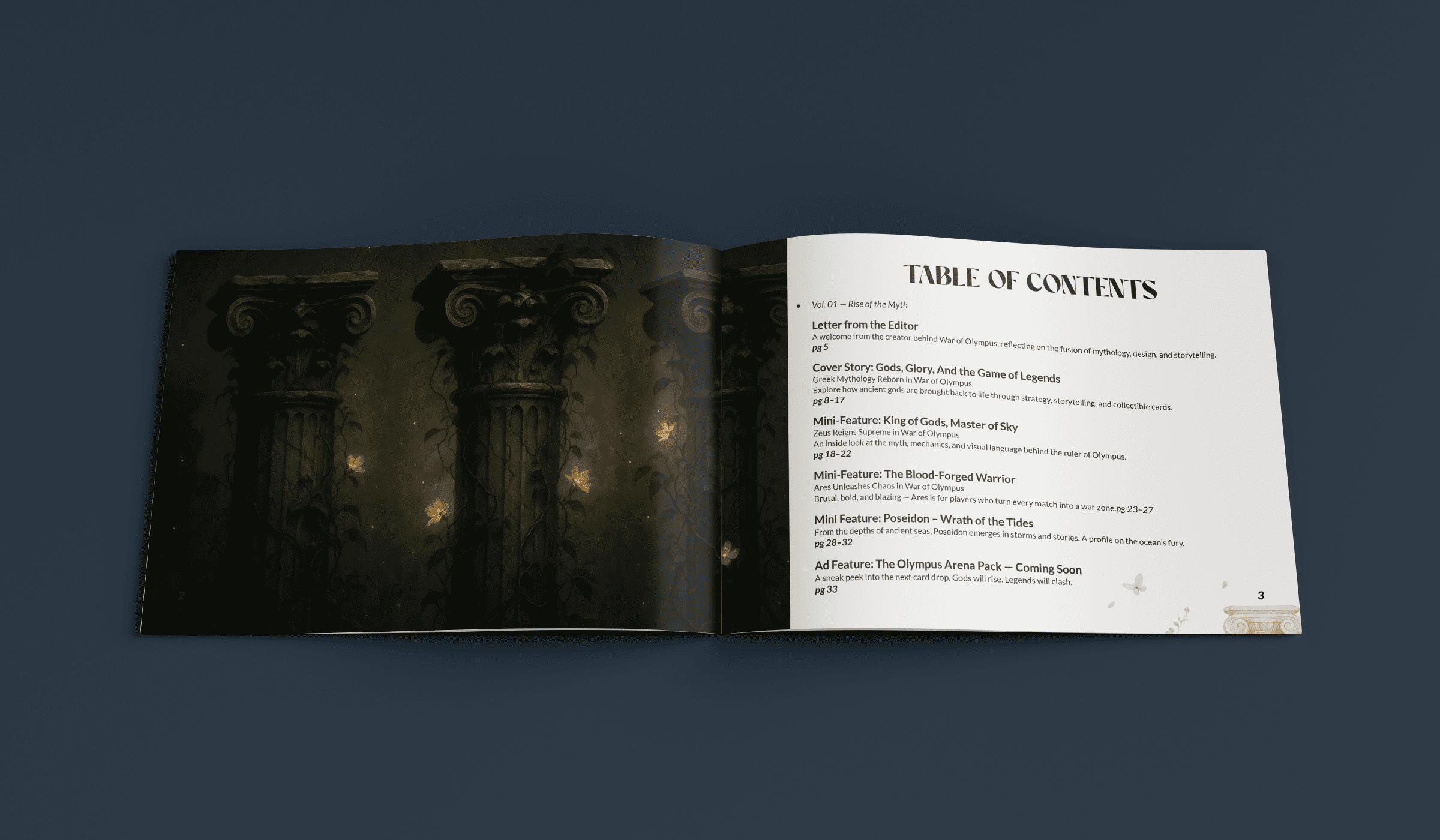
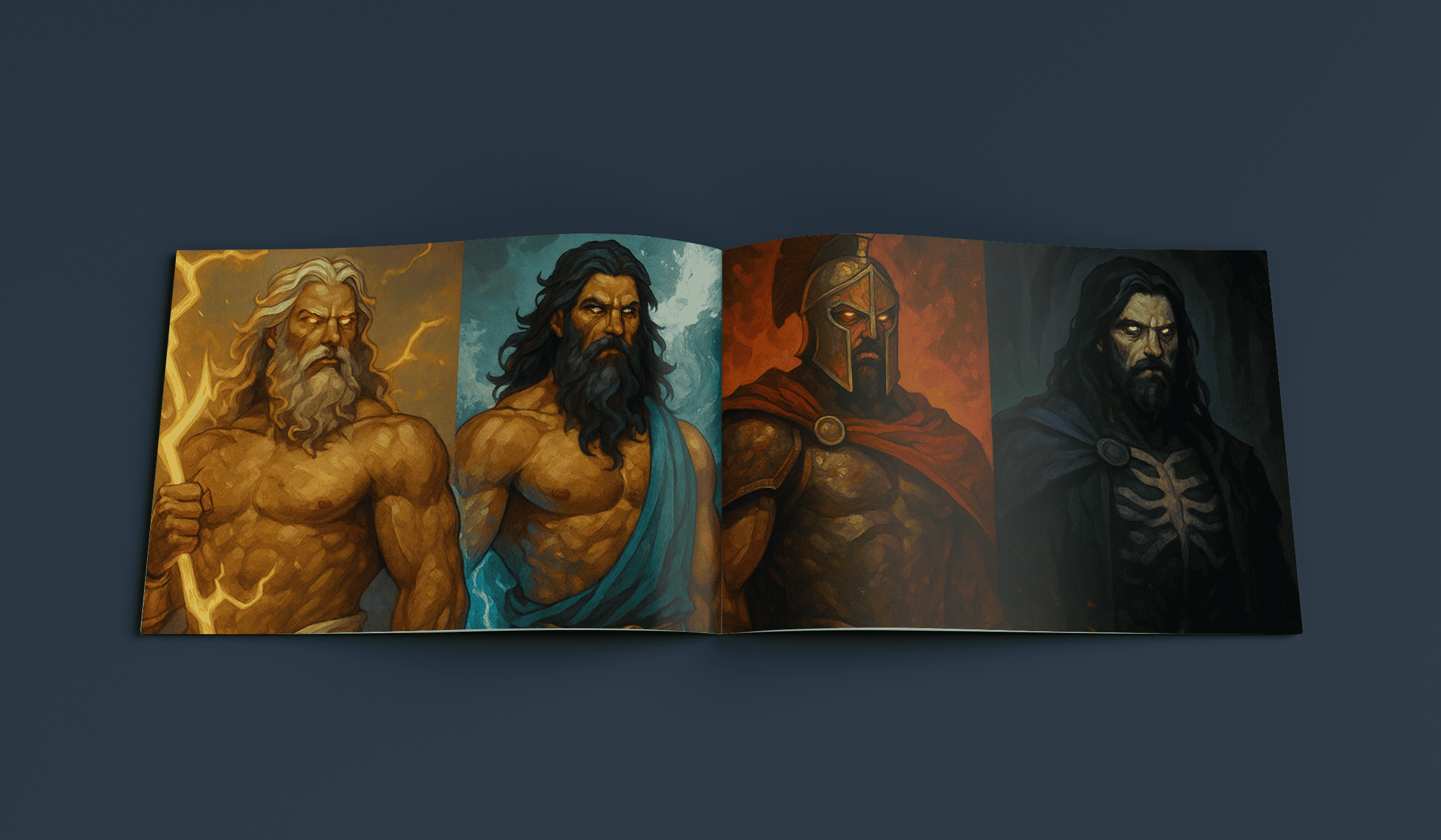
A print and digital manual that expands the War of Olympus universe. It includes character stories, worldbuilding, and behind the scenes development. Designed as full spreads for an immersive read.
Credits
Role: Editorial Designer and Illustrator
Tools: InDesign, Photoshop, Illustrator